Introducing Solstice Components

- Eclipse Foundation
- Library
We’ve rebuilt our component library from the ground up to be more flexible, more stable, and easier to use. Now, whether you’re maintaining an Eclipse project website or a website for an Eclipse Foundation Working Group, you can integrate these components with minimal configuration regardless of your website’s tech stack.
The old library served us well - here’s why we built something better
The old component library, Solstice Assets, was built on top of a combination of jQuery, vanilla JavaScript, LESS stylesheets, and Mustache templates. While it served us well for many years (10+), it had several issues:
- Portability: The legacy component library was tightly coupled to eclipse.org’s global styles, making it difficult to reuse components on other sites without style conflicts. It also introduced significant CSS overhead, increasing the consumer’s bundle size.
- Distribution: Solstice Assets could be included either via NPM or by downloading build artifacts from eclipse.org. The NPM option required a fairly strict build setup, often forcing your tooling to be built around the library’s Webpack configuration rather than your own, which reduced compatibility with other tools. The downloadable artifacts lacked versioning, leading to risk of instability when updates were made.
- Scope: The library tried to do too much. It bundled a full CSS framework (Bootstrap 3), global styles, and a large set of components, making it difficult to adopt selectively or use only what you actually needed. While this worked for sites already aligned with our styles, it created friction for those with their own independent design systems and visual identity.
These issues introduced significant barriers to entry for many developers who aren’t front-end specialists. To better support the Eclipse community, we had to go back to the drawing board and build something more portable, easier to integrate, and focused purely on components. We had to build a component library that was truly for everyone in the Eclipse community, regardless of their technical expertise or the tech stack they were using.
Introducing our new component library
Our new library, Solstice Components , is built on Web Components, a native web platform feature that allows us to define custom HTML elements. This makes the components extremely simple to use: just drop them into your markup like any standard HTML tag. No build step required, it works out of the box.
Web Components are designed to integrate into any web page, regardless of the underlying technology. This means you can use our components in a React app, a WordPress site, or even a plain HTML page without additional setup1.
They also benefit from style encapsulation, so component styles don’t clash with your website’s styles. This improves portability and ease of use.
Examples
To display a list of project adopters for a particular project, you can simply add the following HTML to your webpage:
| |
A list of project adopters for Open VSX as of May 2026
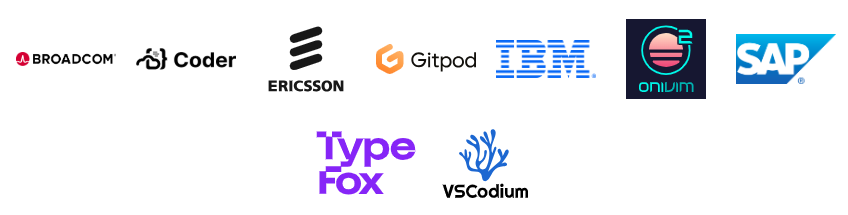
If you want to display a working group’s member organizations, you can add the following HTML:
| |

List of logos from member organizations for the Adoptium Working Group
To display a list of events, you can do the following:
| |
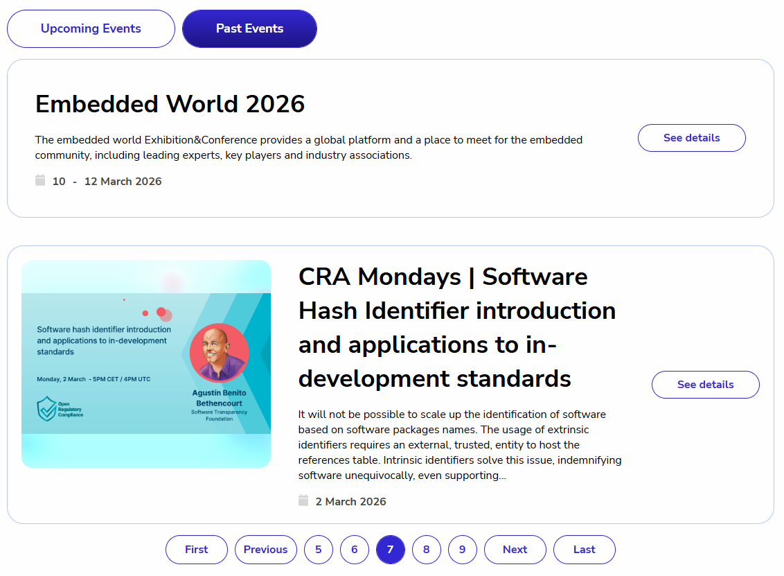
A list of events with the event filters and pagination components
Try it out
If you’re interested in trying out the new Solstice Components, you can find the documentation and installation instructions on our website . It can be installed via NPM or you can find embeds to include the library directly in your HTML from a CDN.
Conclusion
This is just the beginning. We’ve built the foundation for something better, and we’re counting on your feedback to keep improving it. Try the new component library in your existing site. We think you’ll notice the difference immediately. And if you have ideas for new components or improvements, we’d love to hear you by creating an issue ! This library is for the entire Eclipse community.
Web Components still require you to include the JavaScript that defines them in the browser. In our case, they also require a small CSS theme file, but these themes are fully compatible and designed to avoid any style conflicts. ↩︎

Olivier Goulet
Front-end developer at Eclipse Foundation.